viz blog
DG Performance Map
CREATED — 2022-07-12 | DATA UPDATED — 2022-07-12
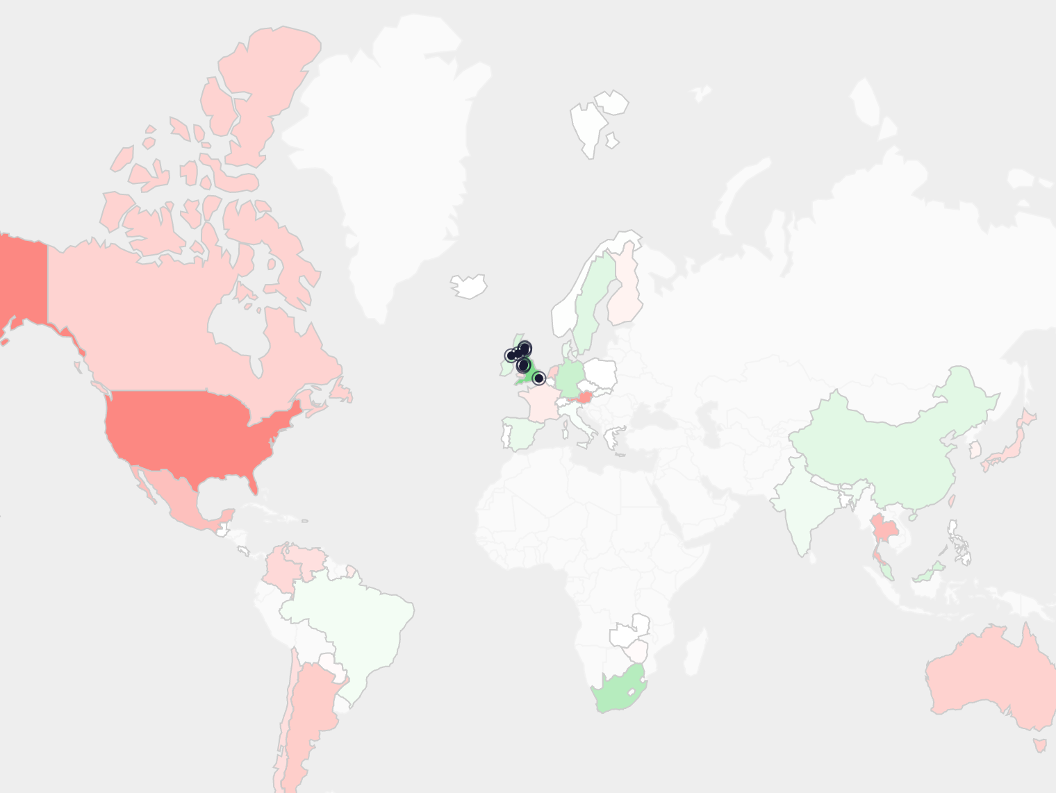
The "performance map" visualizes how players from different countries perform around the world. Data is used from PGA, DP World, and Korn Ferry Tours back to 2010.
Use the left dropdown to select a country (or "The Open") to color the map according to how each country's players perform in the selected country. Performance is measured in expected strokes better or worse per round than baseline (which includes any course history/fit model adjustments); a more detailed explanation of how we calculate these values can be found in this blog post (coming soon).
The second, righthand, dropdown adds the ability to split the data based on which tour a player is based in. For example, Justin Rose would be a PGA/KFT Tour-based Englishman, while Jordan Smith is based on the DP World Tour. This distinction may shed light on the degree to which each tour's courses, playing style, travel, etc. equip their members to perform globally.
Since The Open Championship is being played this week, it has been added to the first dropdown and can be interpreted as it's own country.
Scroll/drag to move around, click countries to auto-zoom, click the ocean to reset the map.
Highlight performance by country in:


players
-0.3
-0.15
0.0
+0.15
+0.3
Observations
The most notable insight from the map is that on average, DP World Tour players perform far better at The Open than PGA Tour players.
American PGA Tour players play particularly poor at The Open (0.12 shots below baseline) while English (and South African to a lesser degree) DP World Tour players perform very well.
Despite growing up around Links courses, PGA Tour-based Englishmen and Scotsmen perform right around their baselines at The Open; this is in stark contrast to their DP World Tour-based counterparts who overachieve at The Open.
Irish/Northern Irish players overperform regardless of the tour they're based in.
Moving away from The Open Championship... here are the 5 countries with the largest "home country advantage":
1.  South Africa (+0.29 strokes per round)
 South Africa (+0.29 strokes per round)
2.  Scotland (+0.20)
 Scotland (+0.20)
3.  Spain (+0.15)
 Spain (+0.15)
4.  India (+0.14)
 India (+0.14)
5.  Mexico (+0.13)
 Mexico (+0.13)
In general, non-American DP World Tour-based players struggle heavily in events in the United States. Spanish (-0.18) and English (-0.16) DP World players have performed the worst with only Italy (+0.02) overperforming slightly.

 Data Visualization Gallery
Bomber's Paradise
2021-12-23
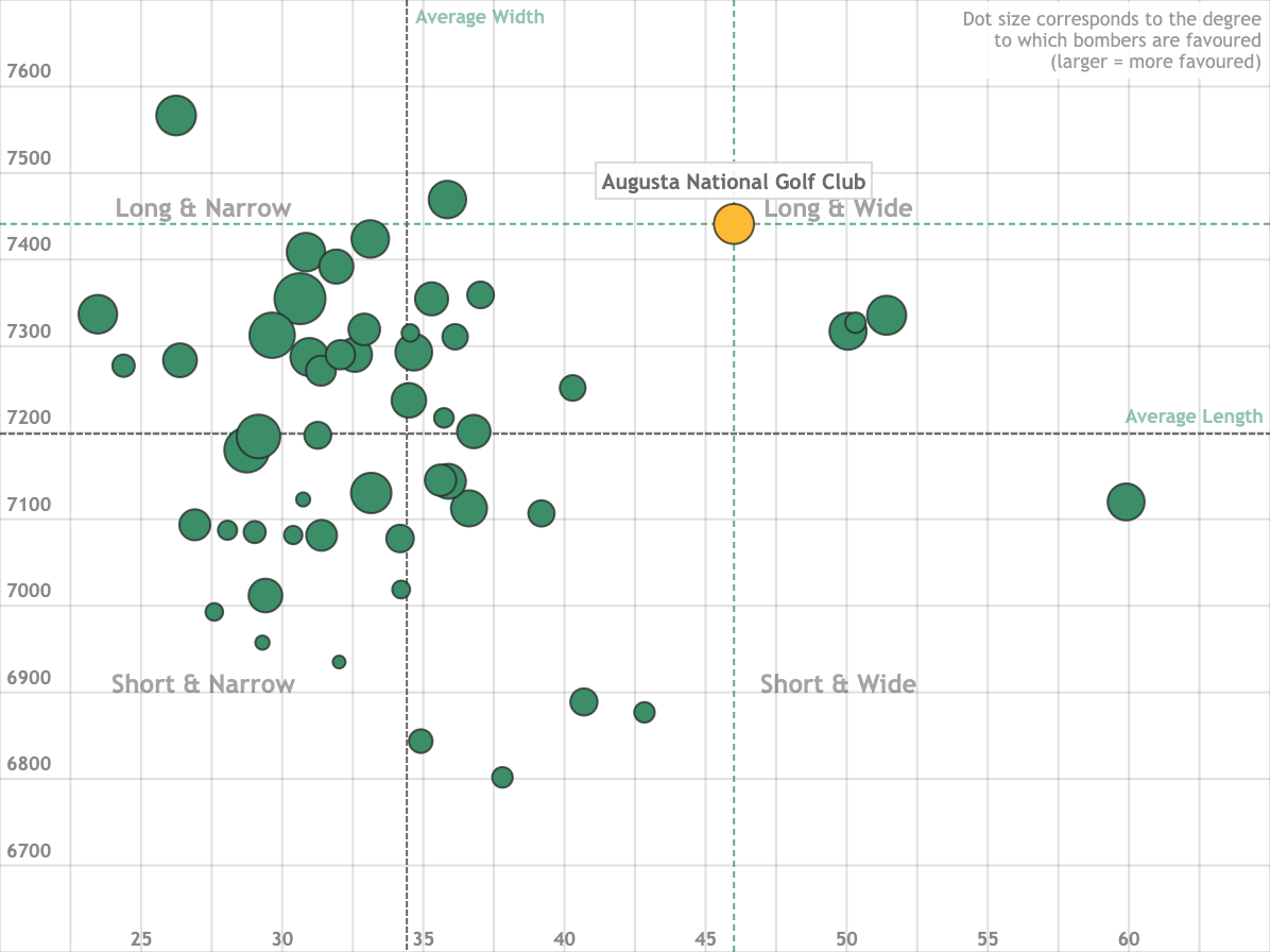
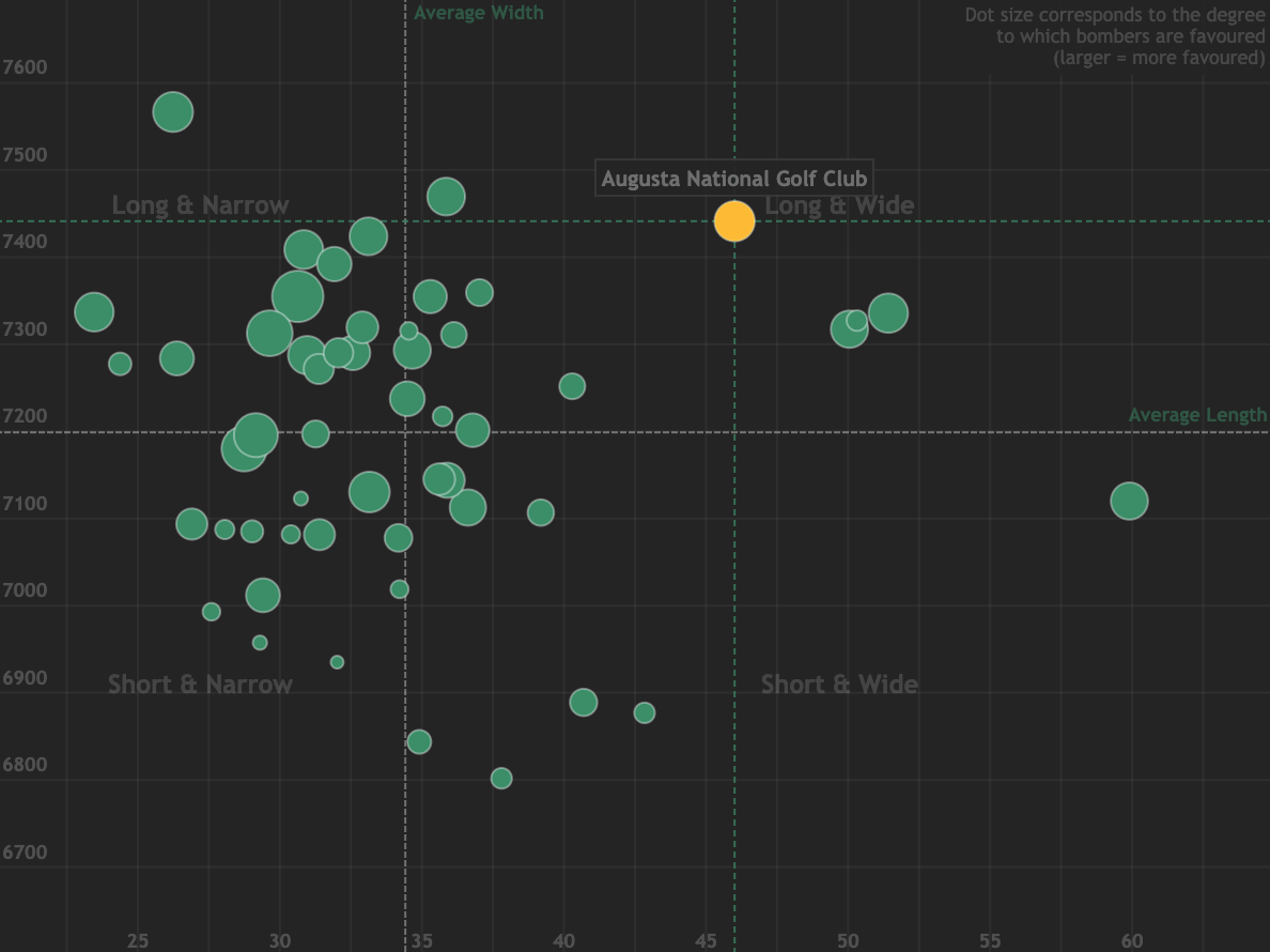
Visualizing the relationship between course length, fairway width, and favourability towards bombers.
Golf Gods Giveth..
2021-12-30
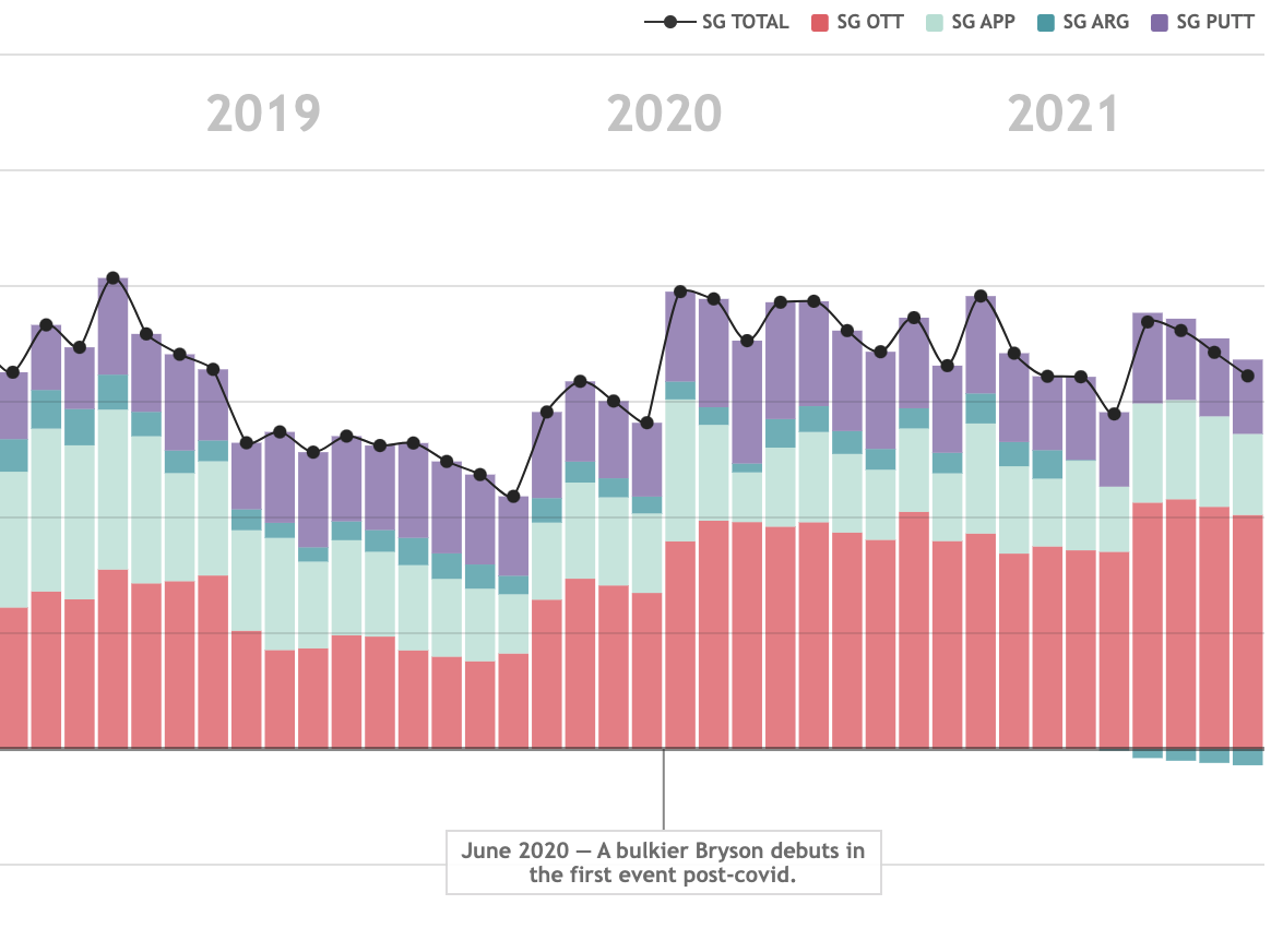
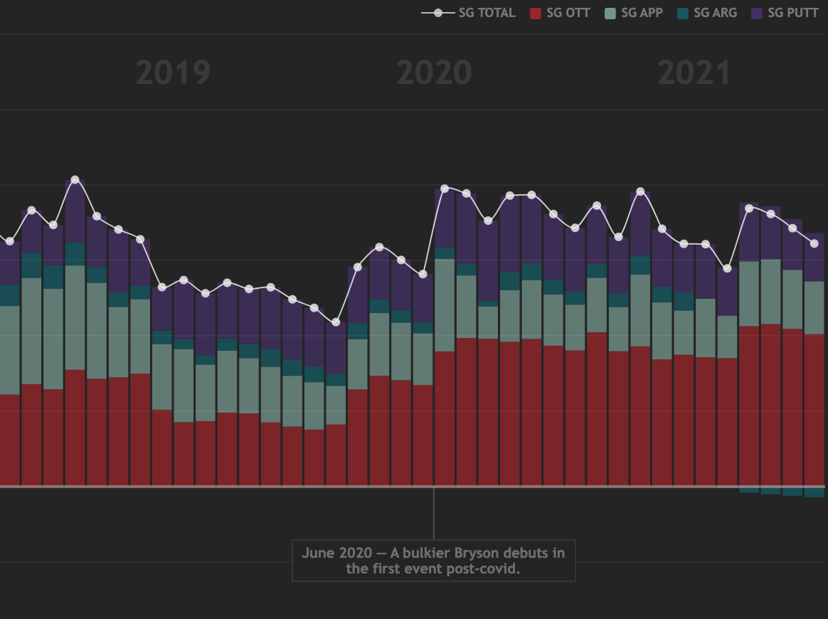
A detailed look at how Bryson DeChambeau's skill profile shifted after chasing, and finding, club head speed.
Peaking for Augusta
2022-04-04
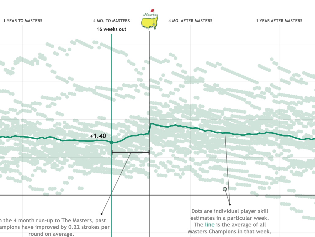
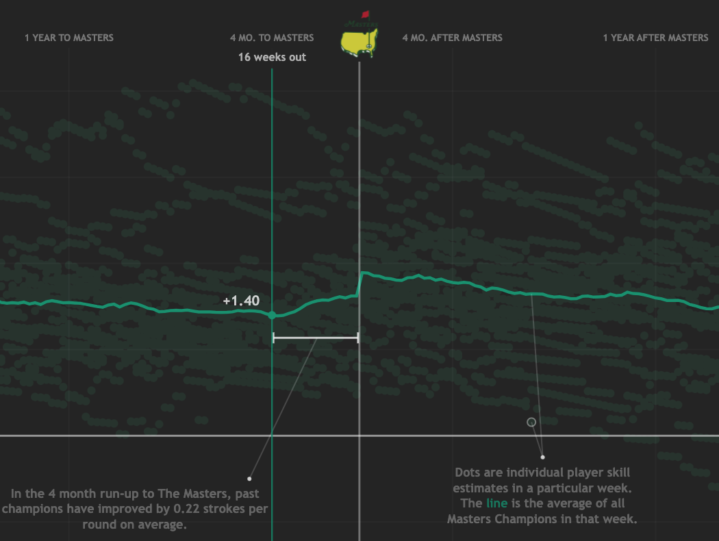
Who is walking the path of a Masters Champion?
Major Performers
2022-06-15
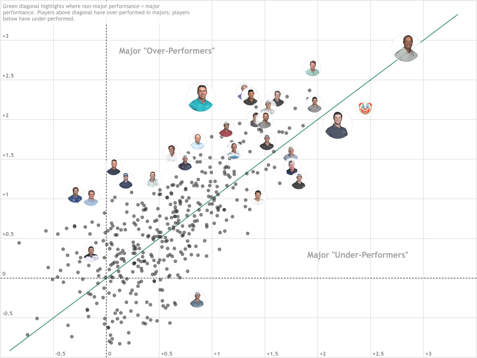
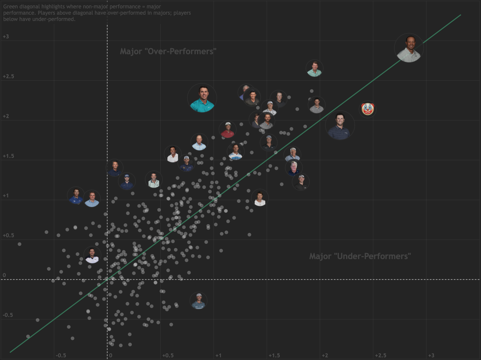
Who steps up their game most at Major Championships?
Performance Map
2022-07-12
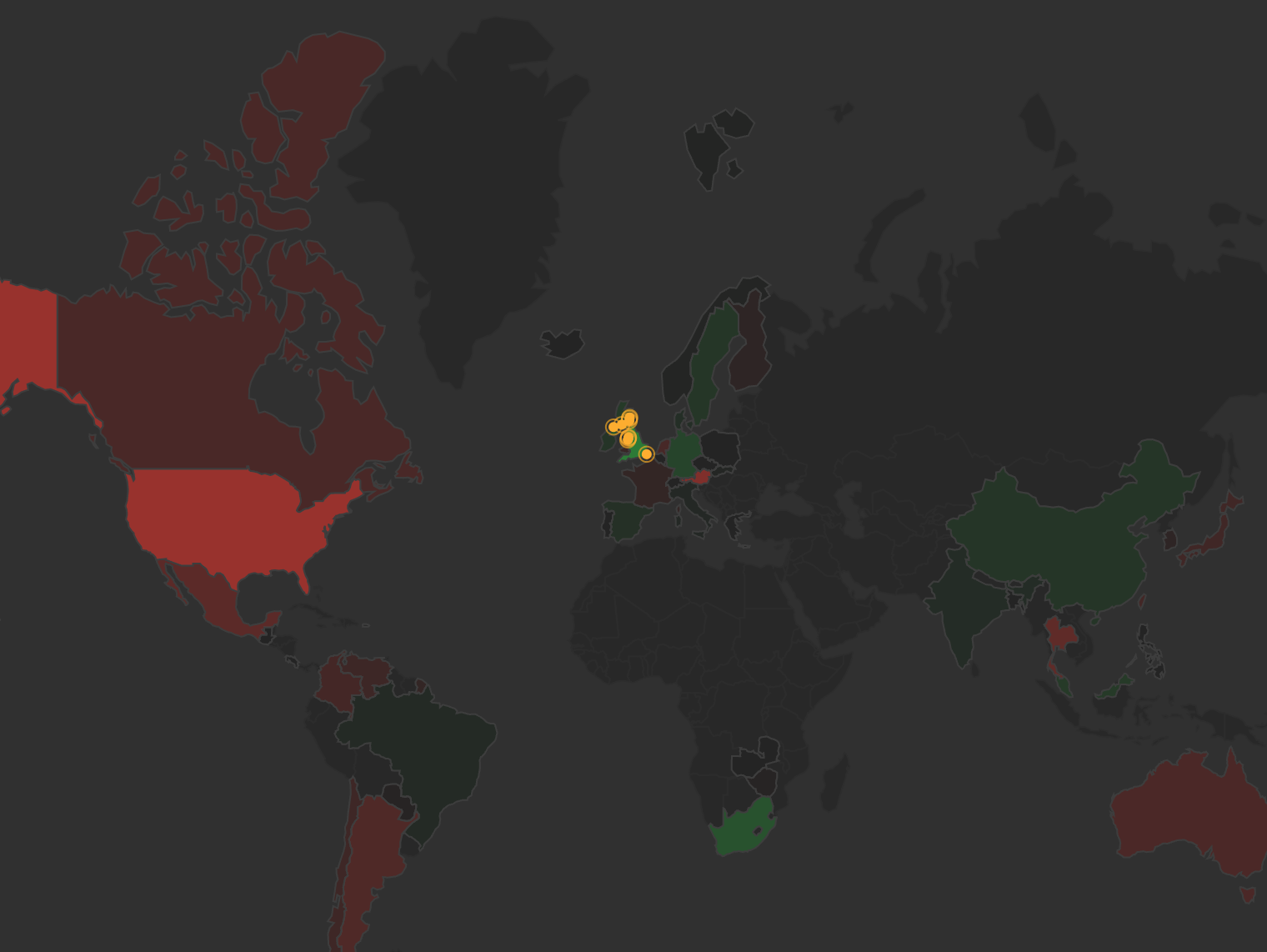
Visualizing how players from different countries perform around the world.
A Short-Lived Celebration
2022-10-16
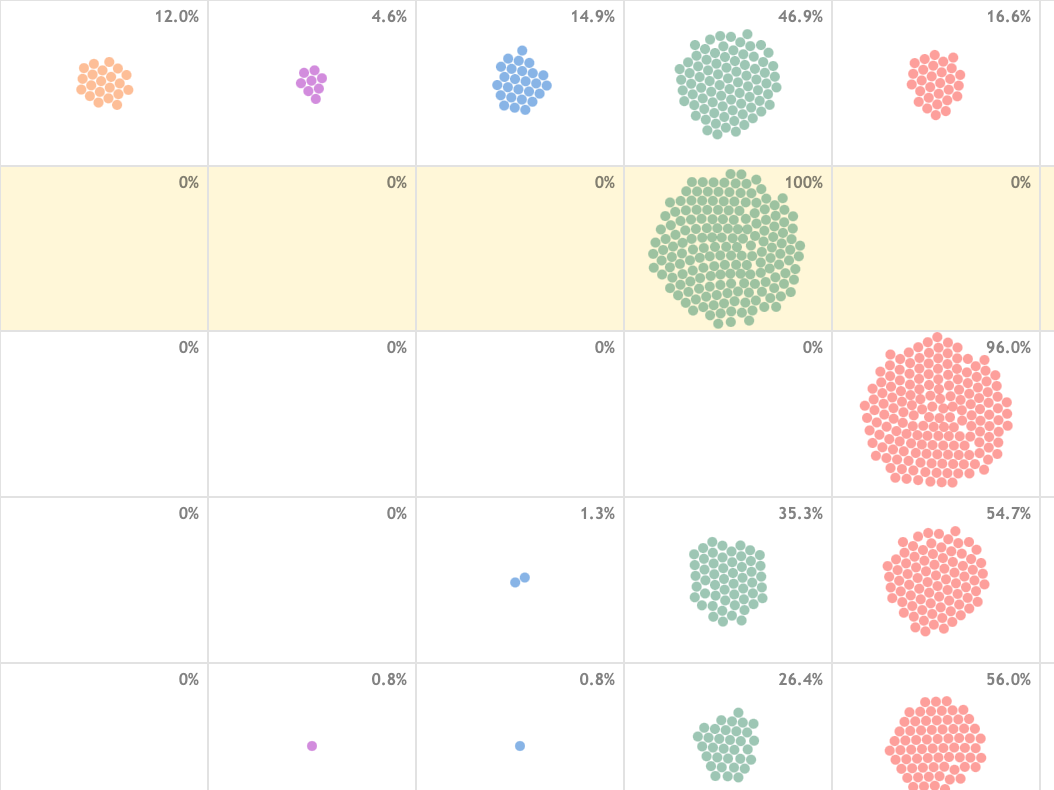
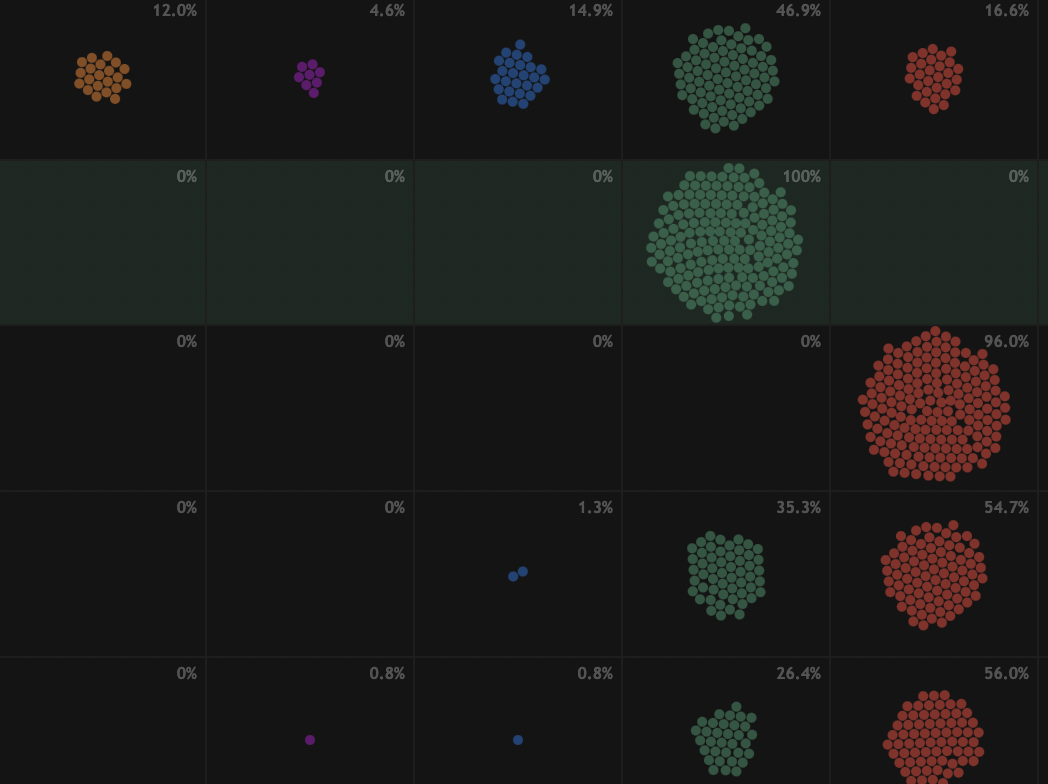
Keeping tabs on 175 Korn Ferry Tour graduates.
When it Rains, it Pours
2023-01-14
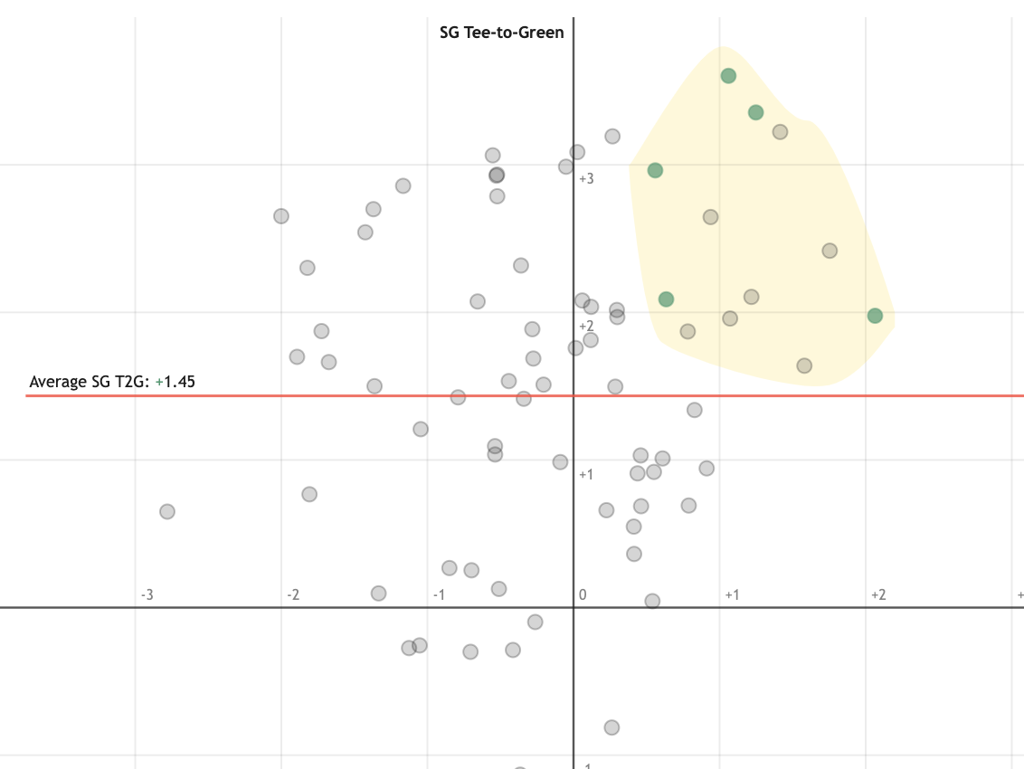
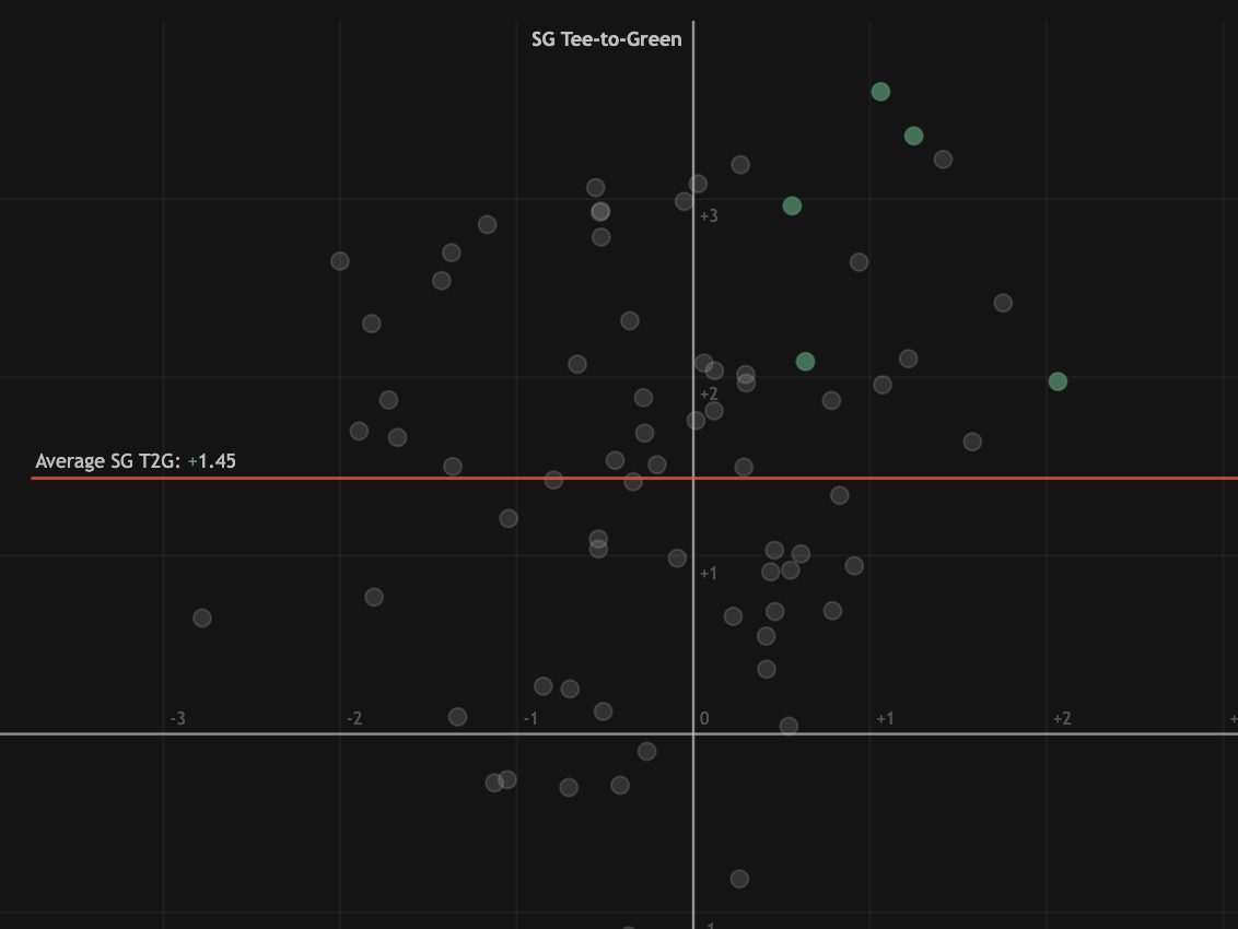
Exploring the mysterious link between Collin Morikawa's putting and tee-to-green performance.
Does Augusta Play Favourites?
2023-04-01
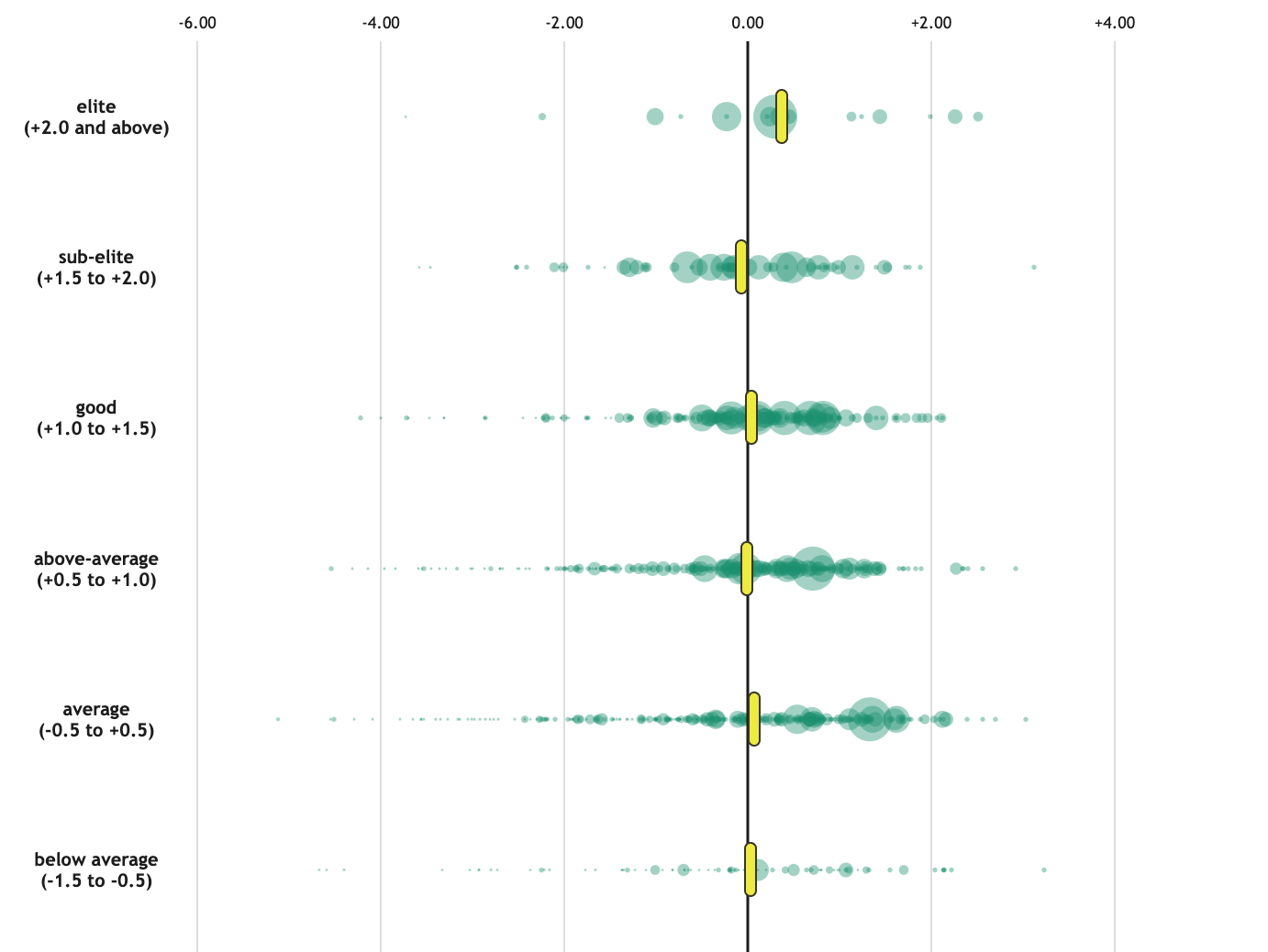
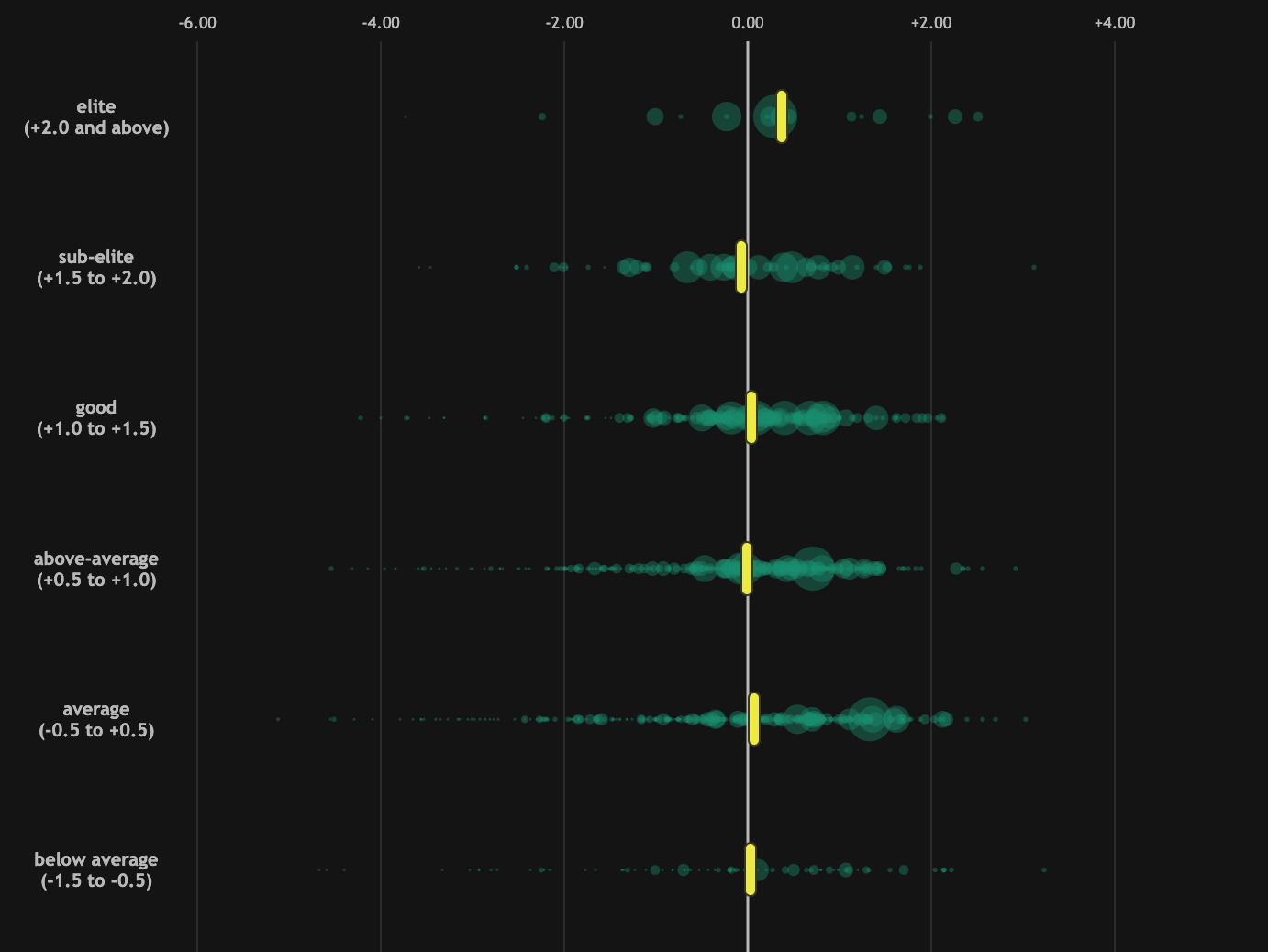
Using data visualization to test Augusta National narratives.
The Skill Dist'n of Major Champions
2023-05-15
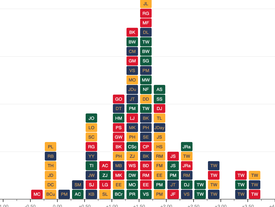
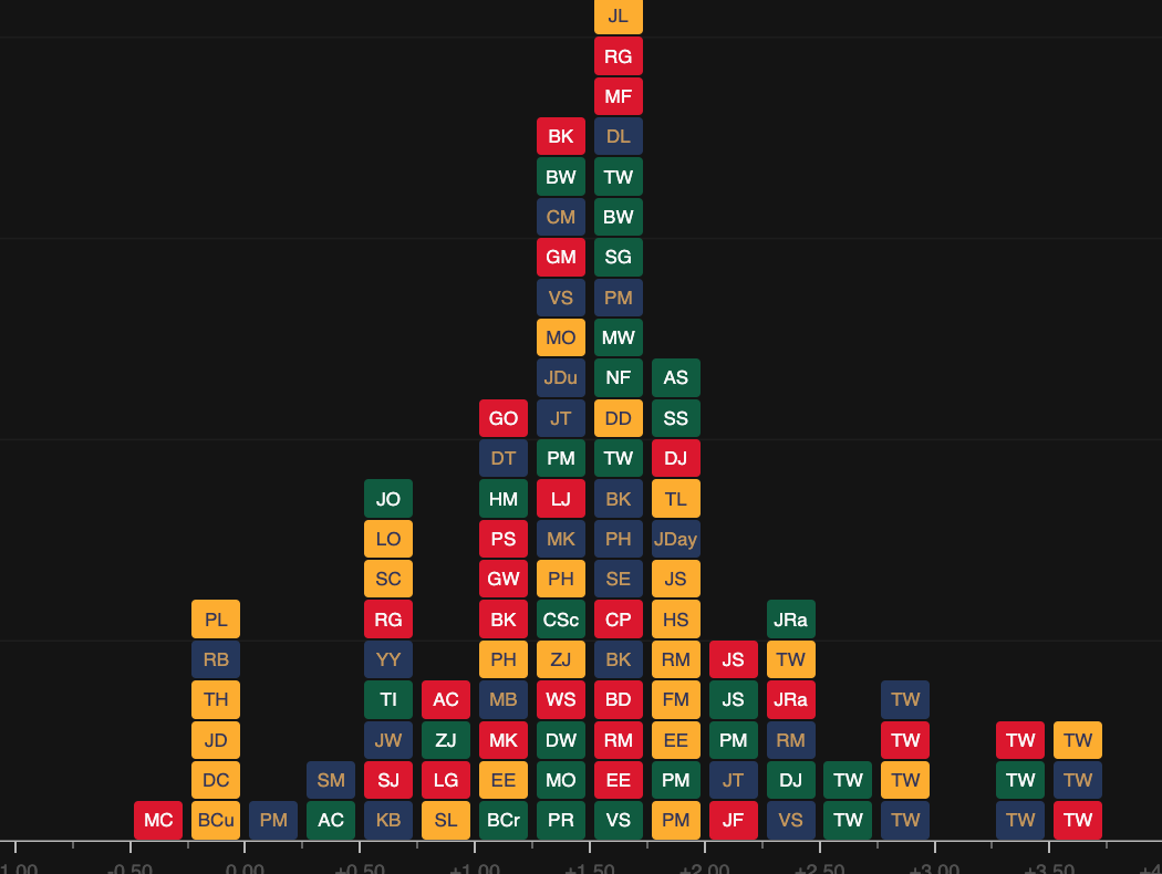
Plotting the skill distribution of the past 112 Major Champions.
The 10th at Riviera
2024-02-14
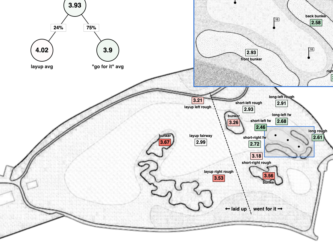
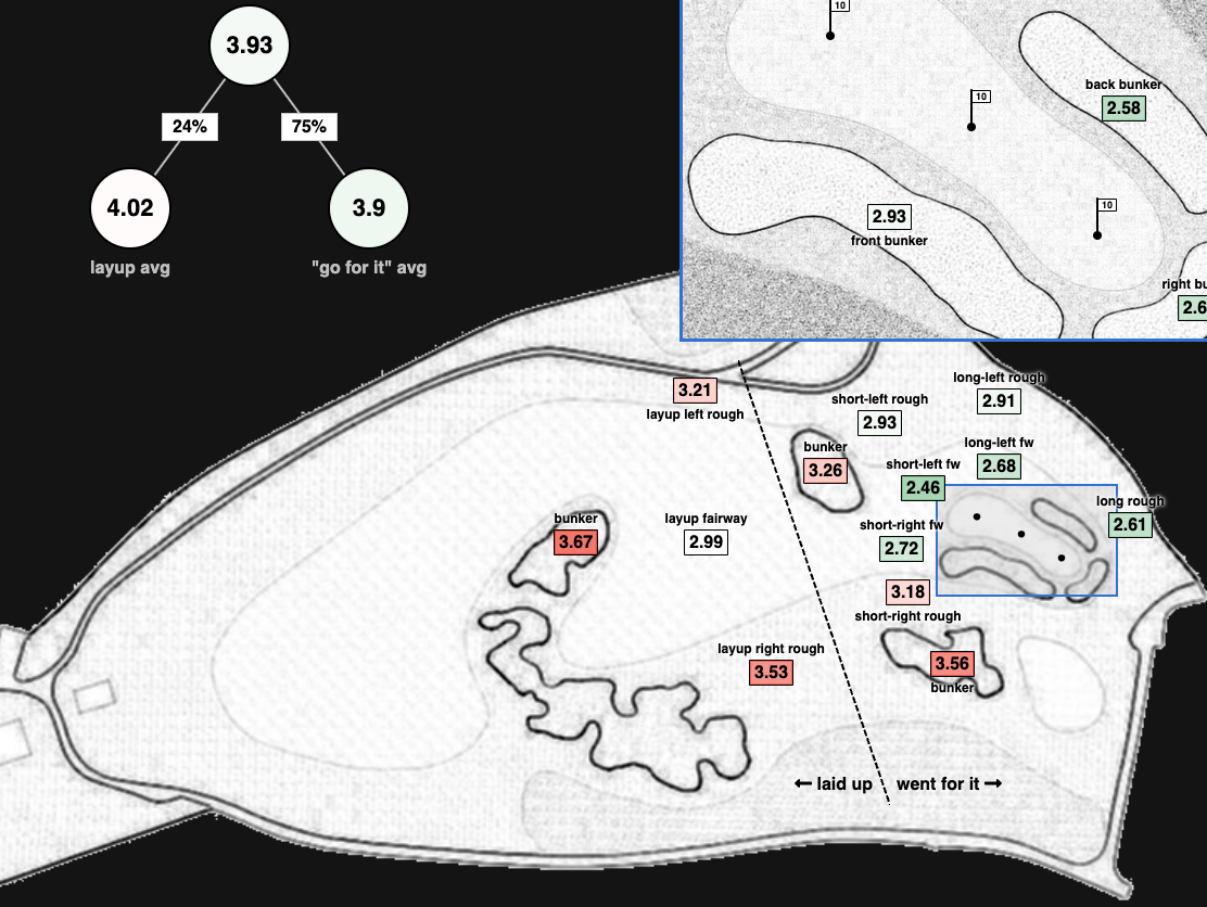
Plotting the average strokes to hole out from various locations.