• Analytics Blog
LAST UPDATED
Nov 1, 2019
Fooled by randomness? Revisiting coaching changes in professional golf
- November 1, 2019
In an earlier blog post we did what could be
considered a descriptive analysis of 39 golfers who made coaching changes since 2004. While there was
certainly a lot of idiosyncratic variation in a given golfer's performance before and after their coaching switch,
in the aggregate we saw that performance declined leading up to the switch and improved
after it, with the average decline and subsequent improvement roughly offsetting each other. In the original post
we were uncritical of this result, suggesting that coaches
"did help [their players] return to their 'pre-slump' level of play". In hindsight, it appears we
may have been fooled by randomness to some degree, as this pattern can (perhaps) also be rationalized by a
purely statistical phenomenon: regression to the mean.
According to Wikipedia, regression to the mean arises when more extreme measurements of a random variable tend to be less extreme when measured again. Hm, well what is a random variable? Again, according to Wikipedia, (informally) a random variable is a variable whose values depend on the outcomes of a random phenomenon. Okay, Wikipedia not being particularly helpful here. Let’s think of a random phenomenon as something that is, at least in part, unpredictable. Unpredictability can take many forms: tossing a coin and seeing which side lands facing up is an obvious example, but it can also simply reflect lack of information — if, instead of tossing the coin, you place it with Heads facing up underneath your hand, the variable “side of coin facing up” is not predictable to me (assuming I didn’t see how you placed the coin) even though it is a known quantity to you [1]. Climbing back up to where we began, a random variable is then some object whose value is, to some degree, unpredictable; regression to the mean is the observation that more extreme values of an unpredictable quantity tend to be followed by less extreme values.
Some examples may help illustrate the point. When rolling a fair die, the expected outcome is 3.5 (each outcome from 1 to 6 is equally likely to arise, and their average value is 3.5). Therefore, if you roll a 6, you can expect that the value of your next toss will be lower, while if you roll a 1 you can expect the value of your next toss to increase. This is regression to the mean in action. Similarly, in a simple model of professional golf scores, you could think of performance as equal to a fixed skill plus luck. Our expectation for a player’s score on any given day is equal to their skill level. As with the roll of a die, if we observe a performance below expectation (i.e. a player’s skill level) one day, then we can expect improvement (relative to that performance) the next. The opposite will also be true: performances above expectation will be followed by worse performances, on average. This provides a less interesting explanation for the common belief that “it is hard to follow up a great round with another good one” — really, this is mostly accounted for by regression to the mean.
So when can we expect regression to the mean to occur? The details are a bit technical, but roughly speaking, as long as the repeated measurements are not perfectly correlated, we will observe some regression to the mean. For an example with golf scores, this would require only that Jordan Spieth's scores are not perfectly correlated from one day to the next; if not, we will observe regression to the mean when comparing Spieth's performances on consecutive days [2].
The example mentioned above in relation to golfer performance following a great round hints at why regression to the mean needs to be considered when trying to tease out cause and effect from data. In Thinking, Fast and Slow, the psychologist-turned-economist Daniel Kahneman provides another example: Kahneman writes of his time working with the Israeli Air Force, and how one of the flight instructors remarked that when a student performed well on a manoeuvre and received praise for it, their subsequent performance on the manoeuvre was worse. The opposite was true for students who performed poorly on their initial attempt: criticism by the instructor was followed by improved performance. Assuming that pilot performance is at least in part due to luck, the instructor had mistakenly given a causal explanation to what was actually just random fluctuations in performance.
It should now be clear why regression to the mean is related to an analysis of the impact of coaching changes in golf. We found that golfers who switch coaches tend to perform poorly leading up to the switch and show improved performance afterwards. By focusing on golfers who switch coaches, we have inadvertently selected for players experiencing spells of poor performance. Given the considerable day-to-day variation in a golfer’s scores, we know that some of this performance dip is likely in part due to temporary underperformance (i.e. bad luck [3]), and therefore we need to account for regression towards the mean when analyzing their subsequent performance.
Put another way, to better estimate the causal effect of changing coaches on performance, we require a reasonable control group for our coach-switchers: that is, a group of golfers who look similar to the golfers who switched coaches, but did not themselves undergo a coaching change. Given the findings from our earlier work, we should look for golfers in performance slumps and compare how they perform in subsequent rounds to the players who switched coaches. This control group will give a rough indication of how much of the improvement observed after switching coaches can be accounted for by regression to the mean.
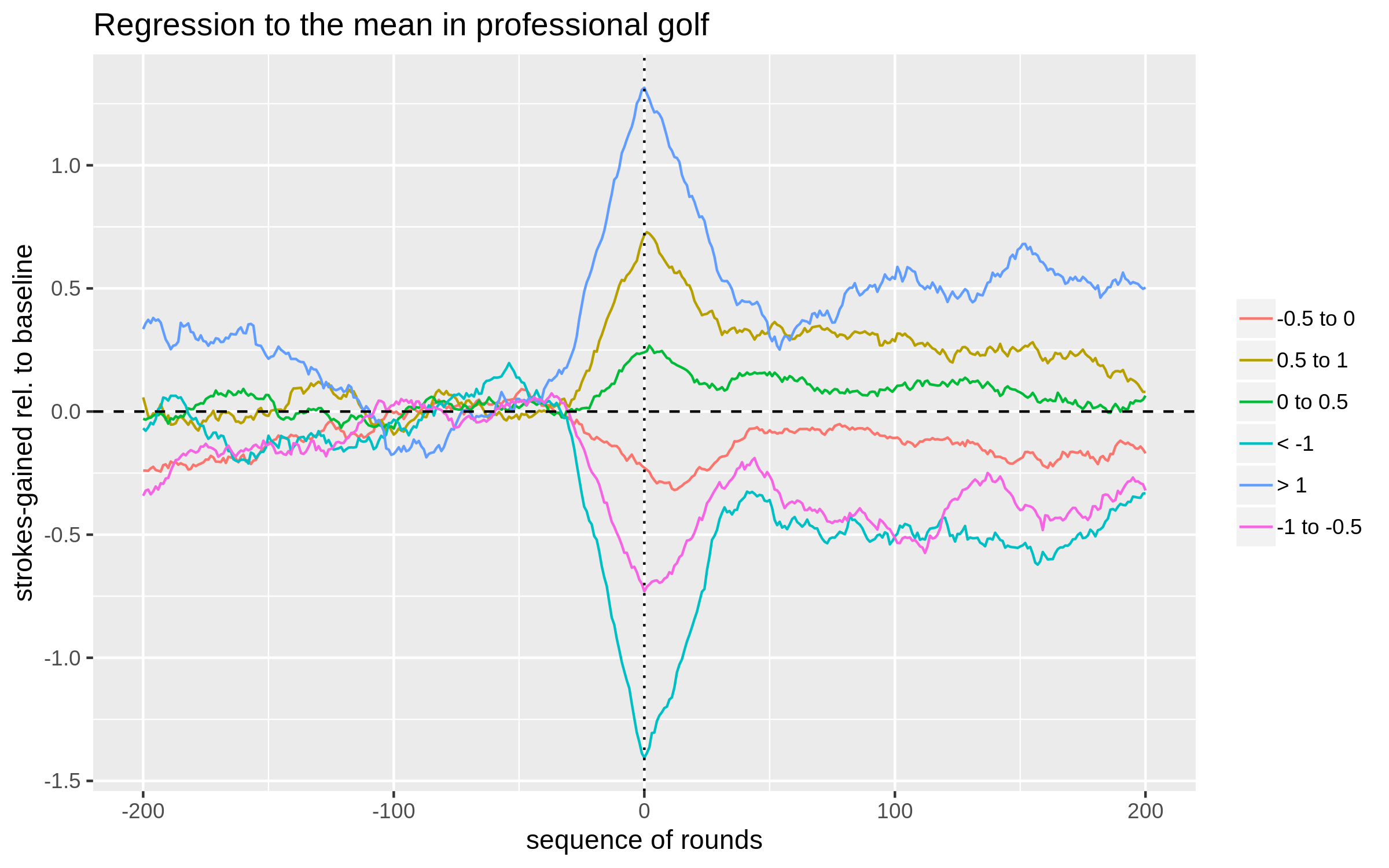
On to the analysis. We consider any player who played at least 400 rounds in our data from 2004-2019; for each golfer, we randomly select a date near the middle of their sample and label this as their "coach-switching date". Performance is then analyzed before and after this hypothetical switching date. The performance metric of interest is defined as strokes-gained relative to a player's baseline skill, where baseline skill is simply defined to be the average true strokes-gained in the 100 rounds from 130 rounds to 30 rounds before the switch occurred (i.e. positions -130 to -30 on the x-axis of the plot below). Groups of players are then formed based on their deviation in performance from this calculated baseline in the 30 rounds leading up to the switch (i.e. rounds -30 to 0). The plot below shows the 30-round moving average for each group before and after the switch date (0 on the x-axis).
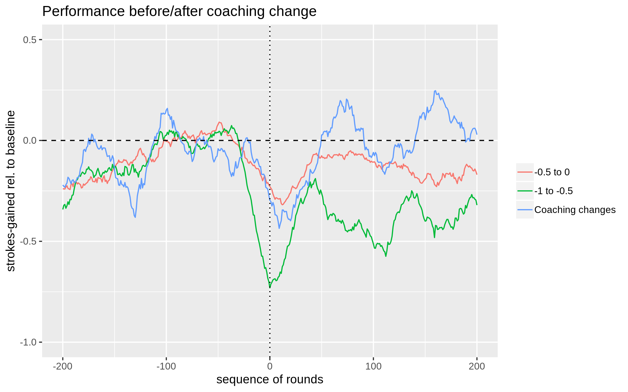
Now that we have a rough sense of the role of regression to the mean in golf, let's compare some of our control groups to the group of players that actually switched coaches. The next plot includes the average 30-round moving average for the 39 players who switched coaches alongside the two most relevant control groups from the first plot.
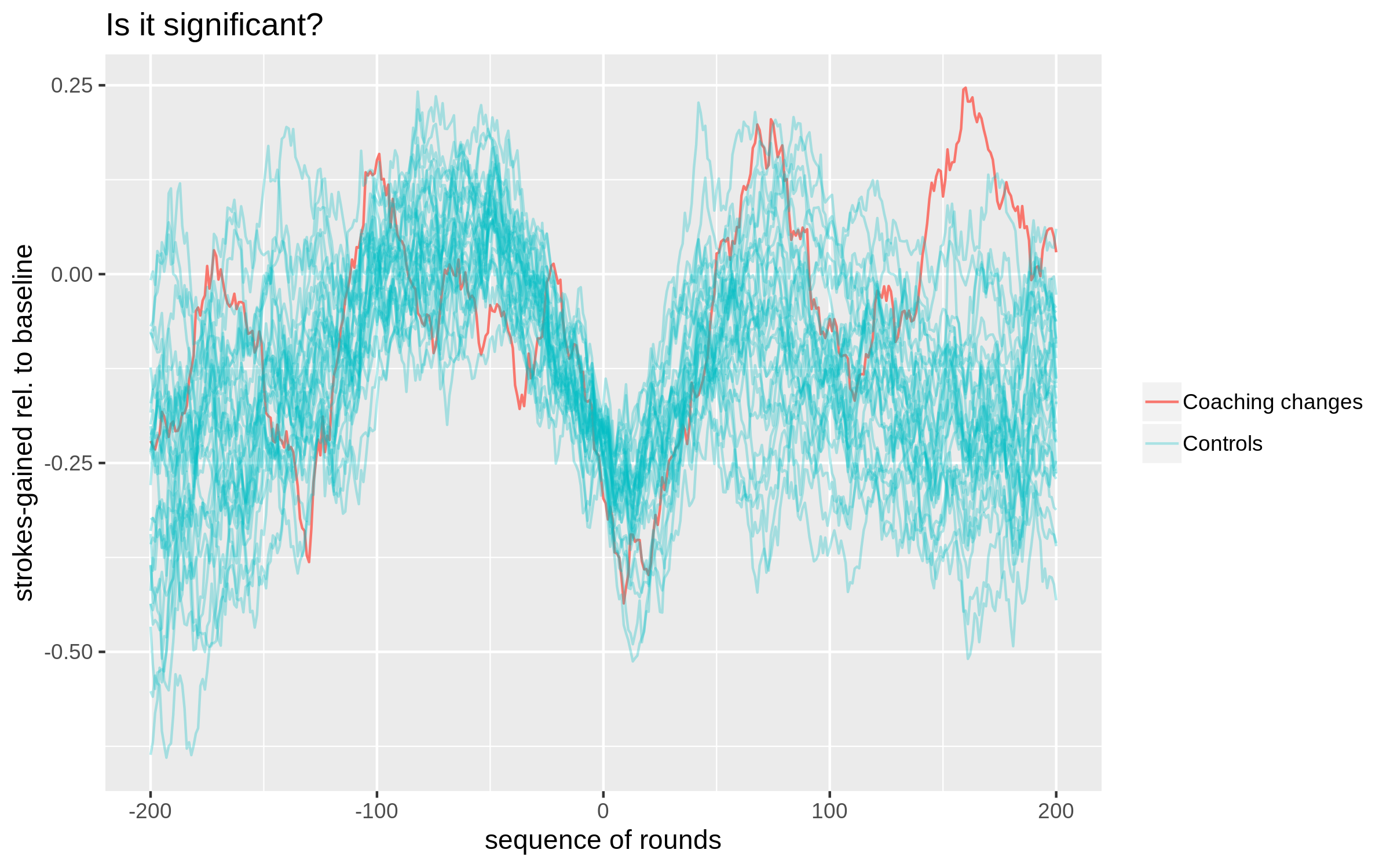
There is a lot of statistical noise hidden behind these averages. To get a sense of where the performance of the actual-switchers fits in with what we can reasonably expect just due to randomness, we repeat the following exercise 30 times: from our full sample of golfers (those who played at least 400 rounds in the dataset), randomly set a date for a hypothetical coaching switch for each golfer, calculate their performance relative-to-baseline leading up to this date as described above, and then randomly select 39 golfers (the sample size of our coaching switch sample) who performed between -0.5 and 0 strokes below baseline leading up to the switch date. Put simply, we are going to repeatedly sample 39 golfers who were in performance slumps and then plot their performance in the subsequent 200 rounds. This provides a rough sense of how much the average performance of a group of 39 golfers can vary. The figure below summarizes the results of this exercise.
So, what to conclude? I would still be hesitant to say that this is anything more than noise. One point to think about is that once you start looking for substantial deviations in performance at any point from 0 to 200 rounds after the coaching switch, you are much more likely to find one. This is analogous to testing multiple hypotheses; as the number of hypotheses under consideration grows, the probability of finding a statistically significant one (when in reality no "true" effects exist) increases. That being said, the actual-switchers here are consistently near the top part of the control group distribution at every point beyond 100 rounds post-switch; it's not as though you have to isolate a single data point to declare victory here.
Relating things back to our original analysis, it seems that some of the improvement post-switch that we attributed to coaching can be explained by regression to the mean. However, the golfers who switched coaches do appear to bring their play back to a level higher than a similar set of slumping golfers who did not change coaches. As a final point, to satisfy the sticklers among you, it still is likely the case that our control group of golfers is different in some meaningful way from the group of golfers who switched coaches. After all, switching coaches is a decision; why one golfer makes that decision and another doesn't could indicate that they are different along some relevant dimensions which could correlate with future performance.
According to Wikipedia, regression to the mean arises when more extreme measurements of a random variable tend to be less extreme when measured again. Hm, well what is a random variable? Again, according to Wikipedia, (informally) a random variable is a variable whose values depend on the outcomes of a random phenomenon. Okay, Wikipedia not being particularly helpful here. Let’s think of a random phenomenon as something that is, at least in part, unpredictable. Unpredictability can take many forms: tossing a coin and seeing which side lands facing up is an obvious example, but it can also simply reflect lack of information — if, instead of tossing the coin, you place it with Heads facing up underneath your hand, the variable “side of coin facing up” is not predictable to me (assuming I didn’t see how you placed the coin) even though it is a known quantity to you [1]. Climbing back up to where we began, a random variable is then some object whose value is, to some degree, unpredictable; regression to the mean is the observation that more extreme values of an unpredictable quantity tend to be followed by less extreme values.
Some examples may help illustrate the point. When rolling a fair die, the expected outcome is 3.5 (each outcome from 1 to 6 is equally likely to arise, and their average value is 3.5). Therefore, if you roll a 6, you can expect that the value of your next toss will be lower, while if you roll a 1 you can expect the value of your next toss to increase. This is regression to the mean in action. Similarly, in a simple model of professional golf scores, you could think of performance as equal to a fixed skill plus luck. Our expectation for a player’s score on any given day is equal to their skill level. As with the roll of a die, if we observe a performance below expectation (i.e. a player’s skill level) one day, then we can expect improvement (relative to that performance) the next. The opposite will also be true: performances above expectation will be followed by worse performances, on average. This provides a less interesting explanation for the common belief that “it is hard to follow up a great round with another good one” — really, this is mostly accounted for by regression to the mean.
So when can we expect regression to the mean to occur? The details are a bit technical, but roughly speaking, as long as the repeated measurements are not perfectly correlated, we will observe some regression to the mean. For an example with golf scores, this would require only that Jordan Spieth's scores are not perfectly correlated from one day to the next; if not, we will observe regression to the mean when comparing Spieth's performances on consecutive days [2].
The example mentioned above in relation to golfer performance following a great round hints at why regression to the mean needs to be considered when trying to tease out cause and effect from data. In Thinking, Fast and Slow, the psychologist-turned-economist Daniel Kahneman provides another example: Kahneman writes of his time working with the Israeli Air Force, and how one of the flight instructors remarked that when a student performed well on a manoeuvre and received praise for it, their subsequent performance on the manoeuvre was worse. The opposite was true for students who performed poorly on their initial attempt: criticism by the instructor was followed by improved performance. Assuming that pilot performance is at least in part due to luck, the instructor had mistakenly given a causal explanation to what was actually just random fluctuations in performance.
It should now be clear why regression to the mean is related to an analysis of the impact of coaching changes in golf. We found that golfers who switch coaches tend to perform poorly leading up to the switch and show improved performance afterwards. By focusing on golfers who switch coaches, we have inadvertently selected for players experiencing spells of poor performance. Given the considerable day-to-day variation in a golfer’s scores, we know that some of this performance dip is likely in part due to temporary underperformance (i.e. bad luck [3]), and therefore we need to account for regression towards the mean when analyzing their subsequent performance.
Put another way, to better estimate the causal effect of changing coaches on performance, we require a reasonable control group for our coach-switchers: that is, a group of golfers who look similar to the golfers who switched coaches, but did not themselves undergo a coaching change. Given the findings from our earlier work, we should look for golfers in performance slumps and compare how they perform in subsequent rounds to the players who switched coaches. This control group will give a rough indication of how much of the improvement observed after switching coaches can be accounted for by regression to the mean.
On to the analysis. We consider any player who played at least 400 rounds in our data from 2004-2019; for each golfer, we randomly select a date near the middle of their sample and label this as their "coach-switching date". Performance is then analyzed before and after this hypothetical switching date. The performance metric of interest is defined as strokes-gained relative to a player's baseline skill, where baseline skill is simply defined to be the average true strokes-gained in the 100 rounds from 130 rounds to 30 rounds before the switch occurred (i.e. positions -130 to -30 on the x-axis of the plot below). Groups of players are then formed based on their deviation in performance from this calculated baseline in the 30 rounds leading up to the switch (i.e. rounds -30 to 0). The plot below shows the 30-round moving average for each group before and after the switch date (0 on the x-axis).

Notes: Data is from 2004-2019 on PGA, Web.com, and European
tours. To be included in the analysis, a player had to have played at least 400 rounds
and not be one of the players in our coaching sample. Point 0 on the x-axis represents
a randomly chosen date for each player. Plotted is a 30-round moving average of
strokes-gained relative to baseline, where the
baseline is defined as the golfer's strokes-gained from rounds -130 to -30 on the plot. Groups
are formed based off strokes-gained relative to this baseline in rounds -30 to 0.
An example for clarity: the blue line aggregates (i.e. it is the average of)
all players who averaged more than 1 stroke per round above their baselines leading up to the (hypothetical) switching date.
All groups cluster around 0 between positions -130 to -30; this is because each golfer's baseline
skill is defined using this 100-round stretch. The main takeaway from the plot is that when a golfer deviates from their baseline for a 30-round stretch,
we can expect about 30% of that form to be maintained going forward. The fact that we do not observe
full regression to the mean indicates that the skill levels of professional golfers likely vary over time.
That is, performing below the previously defined baseline for a 30-round stretch is in part
due to "bad luck", but also due to a decrease in skill level (this statement is only true on average across many
players). There are several things one could quibble about in this analysis, a few of which are
mentioned here [4].
Now that we have a rough sense of the role of regression to the mean in golf, let's compare some of our control groups to the group of players that actually switched coaches. The next plot includes the average 30-round moving average for the 39 players who switched coaches alongside the two most relevant control groups from the first plot.

Notes: The plotted blue line is the (average) 30-round moving average
for the 39 players who switched coaches. The green and red lines are the groups of players
who averaged between -0.5 and 0 strokes below baseline, and -1 and -0.5 strokes below
baseline, leading up to their "switching dates", respectively. The red line is the average
of 154 golfers' performance, while the green line is the average of 85.
The plot speaks for itself, but I'll repeat it anyways. The control group of players
that on average performed somewhere between 0 and 0.5 strokes below baseline leading up to their
imaginary switch dates looks fairly similar to the actual-switchers (i.e. those who did in fact switch coaches) leading up to the switch date.
After the coaching switch, the performance of the actual-switchers continues to decline for a brief period, and then
steadily climbs and surpasses this control group from about round 50 post-switch onwards. In general,
the moving average of the actual-switchers shows more noise because it is comprised of just 39 players, while the -0.5 to 0
control group contains 154 players.
There is a lot of statistical noise hidden behind these averages. To get a sense of where the performance of the actual-switchers fits in with what we can reasonably expect just due to randomness, we repeat the following exercise 30 times: from our full sample of golfers (those who played at least 400 rounds in the dataset), randomly set a date for a hypothetical coaching switch for each golfer, calculate their performance relative-to-baseline leading up to this date as described above, and then randomly select 39 golfers (the sample size of our coaching switch sample) who performed between -0.5 and 0 strokes below baseline leading up to the switch date. Put simply, we are going to repeatedly sample 39 golfers who were in performance slumps and then plot their performance in the subsequent 200 rounds. This provides a rough sense of how much the average performance of a group of 39 golfers can vary. The figure below summarizes the results of this exercise.

Notes: The plotted red line is the (average) 30-round moving average for the 39 players who switched
coaches. Each blue line is the result of a single simulation exercise described in the body of the text.
Some of the simulated groups likely contain the same golfers, but it's very unlikely the same date would also
have been chosen. Taken together, the cloud of blue lines is meant to give an indication of the variation
in performance that is possible for a group of 39 golfers (who didn't switch coaches).
Before the switch date, our controls match the actual coaching switch group pretty well, which is
by construction. This plot makes it a bit more obvious that we are also selecting on golfers' performance
in the rounds from -200 to -130; in this specific case, golfers are more likely to have been underperforming relative
to the baseline period. Moving to performance post-switch, we see that the actual switchers'
performance is pretty middle of the road in terms of what
is expected from rounds 0 to 60; but, from round 100 onwards their performance is in the upper tail
of what could arise due to randomness alone.
So, what to conclude? I would still be hesitant to say that this is anything more than noise. One point to think about is that once you start looking for substantial deviations in performance at any point from 0 to 200 rounds after the coaching switch, you are much more likely to find one. This is analogous to testing multiple hypotheses; as the number of hypotheses under consideration grows, the probability of finding a statistically significant one (when in reality no "true" effects exist) increases. That being said, the actual-switchers here are consistently near the top part of the control group distribution at every point beyond 100 rounds post-switch; it's not as though you have to isolate a single data point to declare victory here.
Relating things back to our original analysis, it seems that some of the improvement post-switch that we attributed to coaching can be explained by regression to the mean. However, the golfers who switched coaches do appear to bring their play back to a level higher than a similar set of slumping golfers who did not change coaches. As a final point, to satisfy the sticklers among you, it still is likely the case that our control group of golfers is different in some meaningful way from the group of golfers who switched coaches. After all, switching coaches is a decision; why one golfer makes that decision and another doesn't could indicate that they are different along some relevant dimensions which could correlate with future performance.